The anatomy of a website that actually sells: what science says (not the gurus)
Real scenario: a tourist is in the ferry line searching "where to stay in Puerto Morelos." They open your site. In three seconds they decide whether to stay or go to your competitor. They didn't read your page. They scanned it. And they already decided.
Most businesses in the Riviera Maya build their website on intuition or by copying a neighbor. The problem is intuition fails, and the neighbor doesn't know either. So this article isn't based on opinions: it's based on real experiments, with thousands of people, supervised by independent universities and institutes. This is what actually moves the needle.
It doesn't start with design. It starts with speed.
Before anyone sees your logo, your site has to load. Google analyzed over 900,000 pages and found something brutal: when load time goes from 1 to 3 seconds, the probability a visitor leaves jumps 32%. At 5 seconds, it climbs 90%.
A slow site is money gone before you even start. The technical goal: load your main content in under 2.5 seconds.
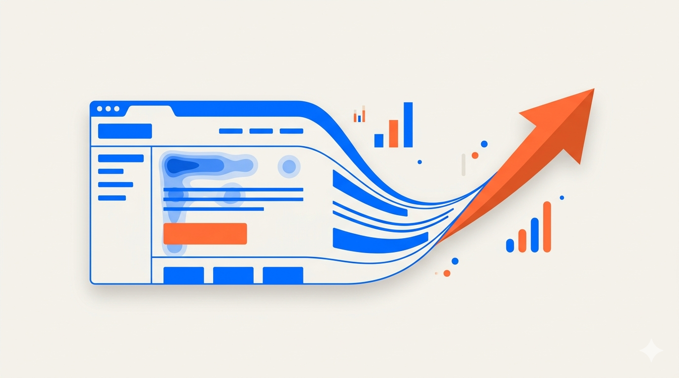
Nobody reads your site. They scan it in an F.
The Nielsen Norman Group fitted 232 people with eye-tracking cameras and found we read pages in an "F" shape: a stripe across the top, another lower down, and a vertical scan down the left. On average, people read only 20–28% of the text. The study was repeated 11 years later with the same result.
What it means for you: the most important thing —your promise and your call-to-action button— goes top and left. If you hide it, it doesn't exist.
The structure the evidence supports
A good site works like a staircase. Each step has one job:
- Hero: what you offer, for whom, what problem you solve. One sentence and one button.
- The problem: name the customer's pain before selling. This is where a Nobel-winning finding kicks in: loss aversion. Kahneman and Tversky proved that losing something hurts nearly twice as much as the joy of gaining it. That's why "stop losing bookings" hits harder than "gain more bookings."
- The solution: explain it in three steps max. Less friction, more action.
- Social proof: testimonials with a name, a number, and a face. One of Robert Cialdini's best-documented principles: we trust what others like us have already validated.
- Benefits, not features: don't say "300 Mbps WiFi," say "work without anything lagging."
- Authority: years, guarantees, certifications. Verifiable facts, not adjectives. It's the basis of the E-E-A-T criteria Google uses to evaluate your site.
- Objections (FAQ): every unanswered doubt is an exit door.
- Final call + close: repeat the action once they're convinced. If scarcity is real, use it. If it's fake, it burns you.
The case worth 300 million dollars
The best proof this is real: a large online store forced users to register before buying. Usability expert Jared Spool found that simple form scared people off. They replaced it with a "Continue as guest" button. The result? 45% more purchases and an extra 300 million dollars in one year. One button.
The point where you lose customers is usually the one you're not watching.
Where the money really leaks: the form
The Baymard Institute, with over 200,000 hours of research, documented that 70% of carts are abandoned. The three most common leaks apply to any business: surprise costs at the end, mandatory registration, and too many form fields. Every extra field costs conversions.
The honesty that sets us apart
Here's something few will tell you: not every "trick" works all the time. The famous "fewer options sell more" (the jam study) was qualified by later meta-analyses: it depends on context. That's why at Consultors K we don't apply recipes blindly.
Evidence tells you where to bet; your own data tells you if you were right. That's why we measure.
Does your site pass the test?
Ask yourself these questions. Every "no" is a chance to sell more:
- Does it load in under 3 seconds?
- Is it clear in 5 seconds what you offer and what to do?
- Do you have real testimonials with a name and a number?
- Does your copy talk about benefits, not features?
- Does the form ask for the minimum and allow progress without forced registration?
- Do you know the exact point where people leave?
In short
A site that sells isn't the prettiest: it's the one that removes everything that gets in the way of the decision. That's the conclusion reached, by different paths, by behavioral economics, eye-tracking, and conversion data.
At Consultors K we build sites with this logic: fast, clear, and designed to turn visitors into customers. If your current site doesn't pass the 6-question test, let's talk. An honest audit can be the difference between a site that decorates and one that bills.
Did you like this article?
Share it with other entrepreneurs in Puerto Morelos
Related articles

600,000 tourists came through Quintana Roo in one week. How many came through your business?
600,000 tourists came through Quintana Roo in one week of Holy Week 2026. The official numbers and what they mean for your local business before summer.
Why Your Tourism Business in Puerto Morelos Needs a Professional Social Media Manager
Professional Social Media Manager for tourism businesses in Puerto Morelos. Complete social media management, strategic content, Meta ads and measurable results. Your tourism business deserves professional digital presence.
Digital Marketing in Puerto Morelos: Guide to Stop Being Invisible
Is your Puerto Morelos business invisible on Google? Strategic guide to Digital Marketing, Web Development, and Social Media to dominate the local market.
Enjoyed this article?
Contact us for a free consultation and discover how to apply these ideas to your business.